
A logo has to do two jobs. It has to be instantly recognizable at the size of a favicon. It also has to feel like the product the first time you see it. Most marks get the first job and miss the second. With a coaching product, that gap shows.
The Grove mark went through three honest tries before it earned its shape.
Phase 1: three basic leaves.
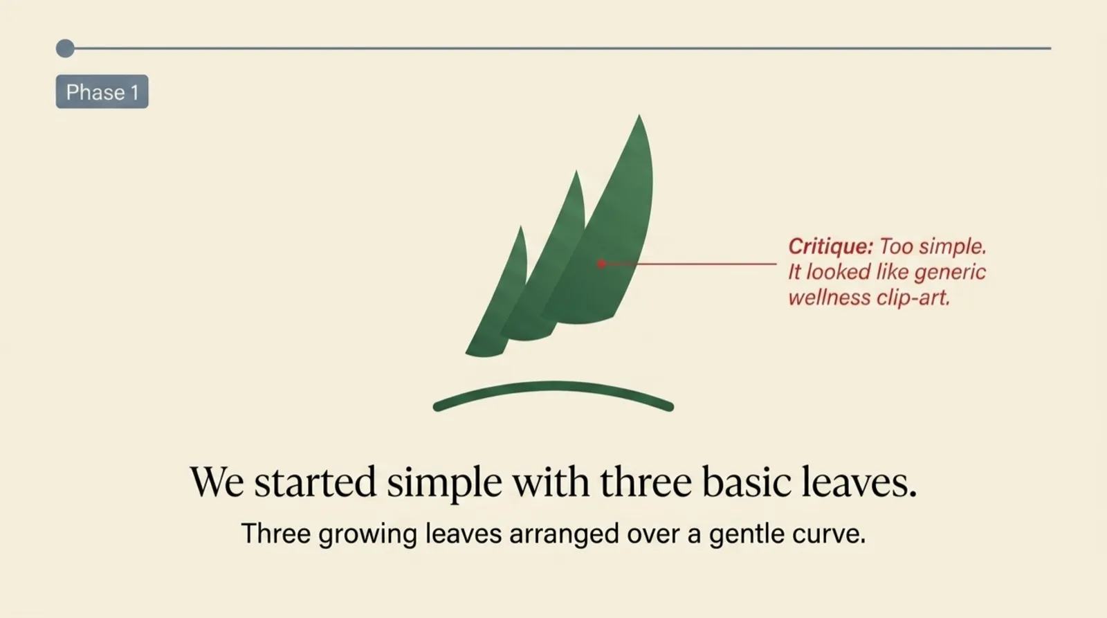
Three growing leaves over a gentle curve. Clean, calm, and indistinguishable from every other wellness brand. The instant a designer or a coach saw it, the response was the same: this is the leaf you see on a bottle of supplements. It was too simple to do the second job. Coaching is not generic, and a generic mark can’t feel like it.
Phase 2: a literal sapling.
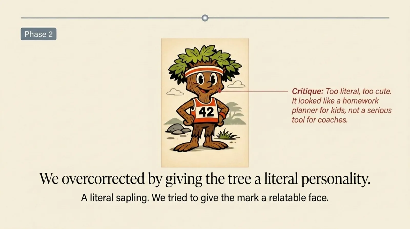
The overcorrection was to give the tree a personality. An actual face. An actual outfit. The intent was warmth. The result was a children’s mascot in a 5K bib. It was hard to argue with as a sketch and impossible to ship next to a coach’s headshot.
Both of those phases failed for the same reason. The metaphor was being asked to do the work, not the mark. A leaf isn’t coaching. A cartoon tree isn’t coaching either. We had to earn the metaphor instead of forcing it.
Phase 3: a grounded, growing tree.
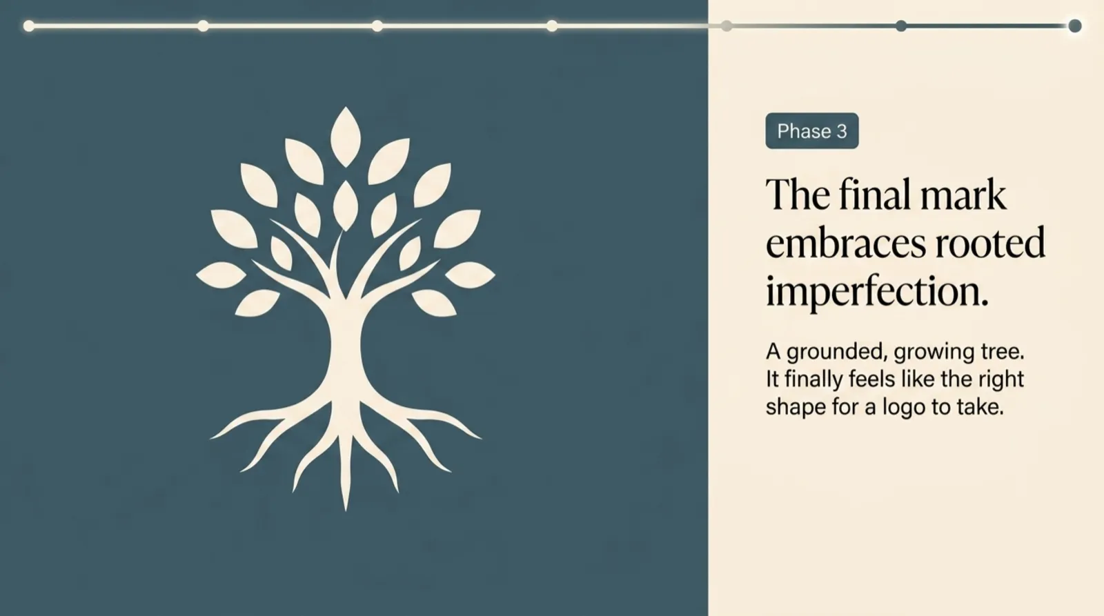
The third version is what shipped. A tree with a full crown of leaves, a short trunk, and roots that show. Two things about it are doing real work:
The leaves are a community. A grove is not a single tree. It is a collection of them. Each leaf in the crown is a relationship, which is what a coach’s roster actually is.
The roots are visible. This is the part I am most attached to. Most of coaching happens between sessions, in the work below the surface. A tree without roots is a houseplant. A coaching practice without the work between sessions is the same.
The mark is small now. It sits in the corner of the app and on this page. I notice it most when a coach sends a note about their week and the tree is sitting quietly above it, looking like the product feels.
A logo’s first job is to be recognizable. Its second job is to feel like the product the first time you see it. A leafy crown and roots that show. That ended up being it.

Founder of Grove. Twenty years building software for skilled professionals. Currently writes mostly on Tuesdays from a small studio in Austin.